
IKEA have consistently set the standard in all markets (with the exception of one faux pas in Russia).
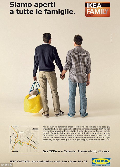
Left (Italy): "we are open for all families".
Right (UK): another modern family, interracial and all. If that does not look "comfortable", what does?
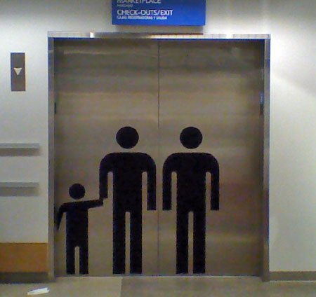
Elevator icons, showing a 'modern family' (Stoughton, Mass.)
IKEA has always been a frontrunner in portraying gay couples as-a-matter-of-factly.
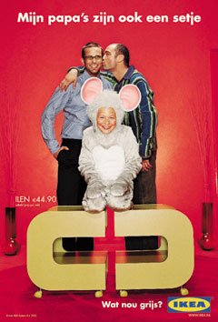
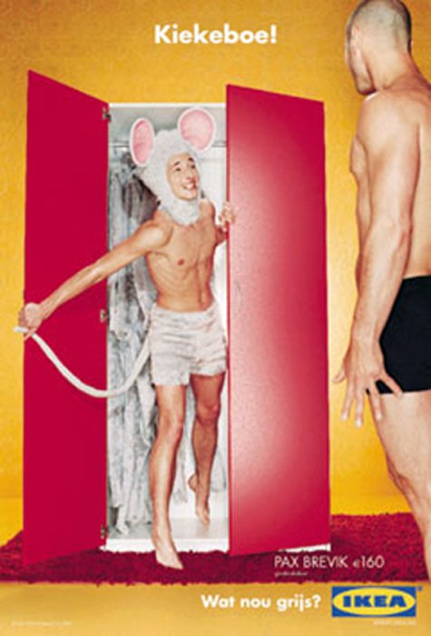
Left: "My daddies are also a set", right "Peekaboo" coming out of the closet.
Click on pictures for larger image.
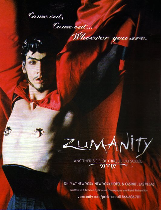
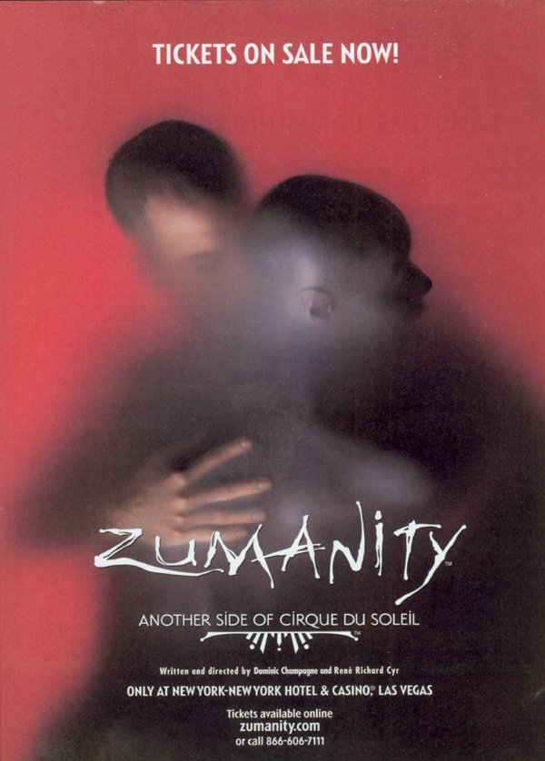
Cirque du Soleil with a direct gay reference: "Come out, come out... Wherever you are". Followed by the tagline "Another side of Cirque du Soleil".

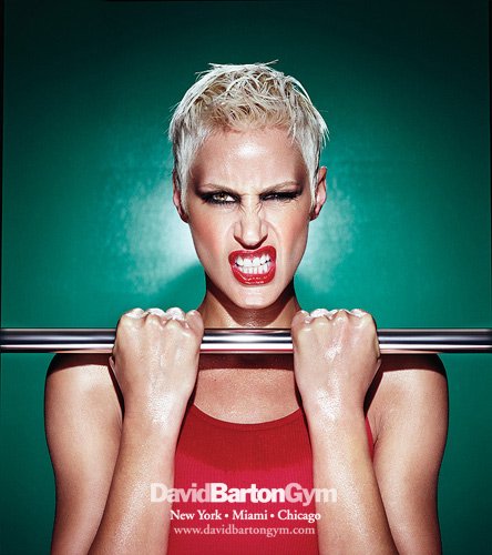
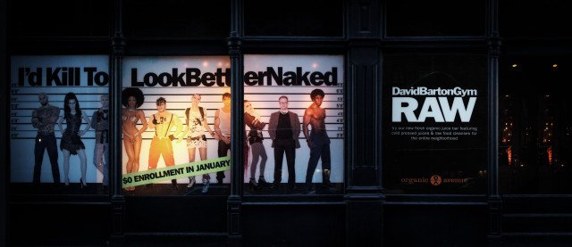
The marketing of New York's David Barton gym in Chelsea comes ‘straight’ to the point. The message here is not "feel better" or even "look better." It's "Look Better Naked". Staying true to its identity – and to its predominantly gay male clientele – the gym's trainers greet clients wearing jeans and tight T-shirts, teaching classes such as "ASSolutely ABBulous," "Hot Core" and "WillPower & Grace." The description on that last one is "Pilates meets Pain & Pleasure without any equipment (is that possible?!)" Hey, at least they know their brand.
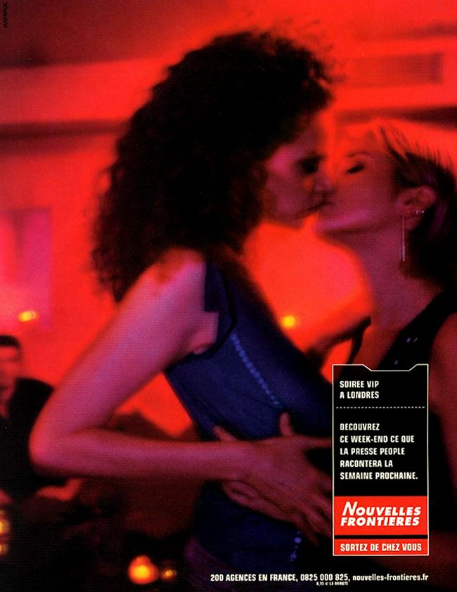
Travel agency Nouvelles Frontières: setting new boundaries?
German beer Cölner Hofbrau advertising during the Cologne Pride (CSD): "Especially tasty when it gets warm in Cologne".

© 2022 BRIGHT Marketing Solutions